SELECTED WORK / WISCOBEES
WiscoBees.
A complete brand.
An online store.
A family of products.
THE PROJECT
From brand identity
to the product shelf.
WiscoBees is a premium honey-bee and raw-honey retailer. I developed its visual identity, designed the website, and built its online store using WooCommerce.
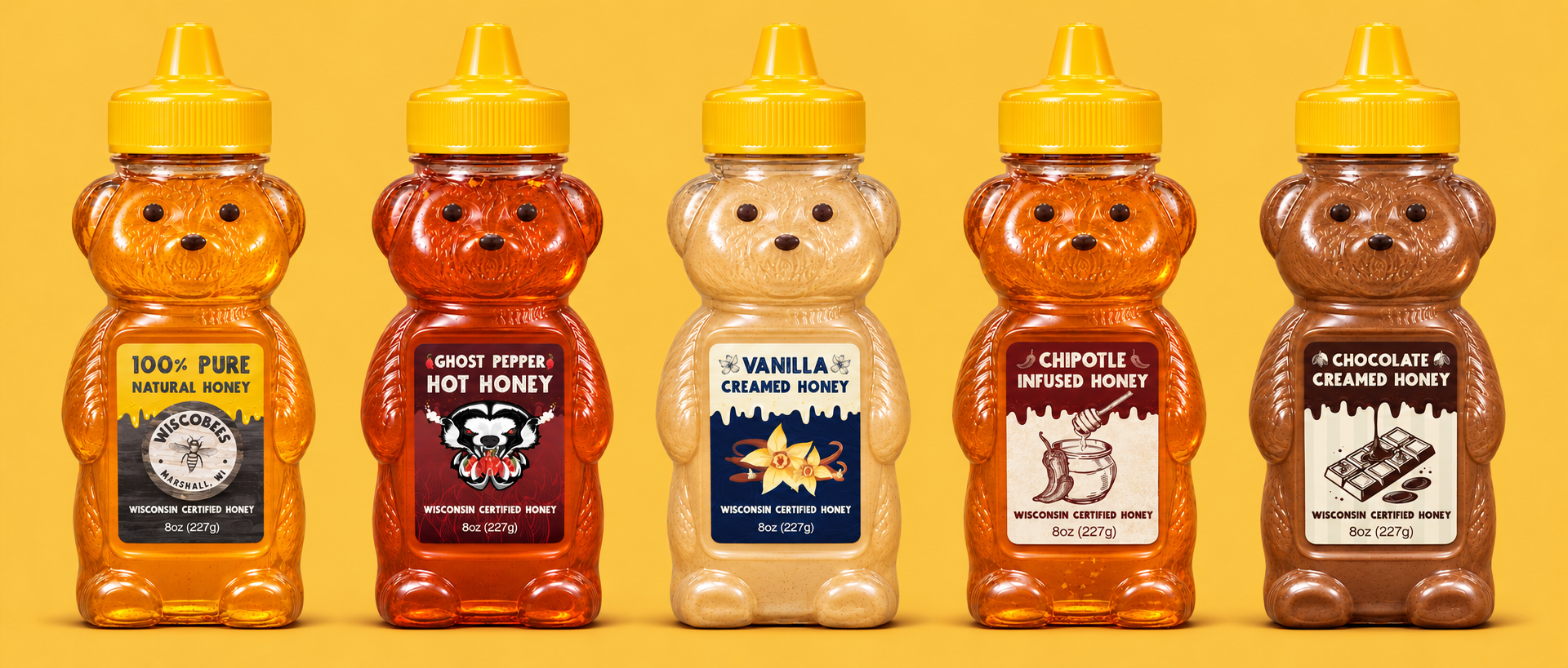
I also designed the packaging for its original honey and four flavored varieties across multiple package sizes. The work connected the online storefront to the physical product—and extended to UPC registration, barcode integration, and size-specific nutrition and net-weight labeling.
BRAND IDENTITY
A Wisconsin
identity.
I designed the WiscoBees logo around a hand-drawn bee and a textured circular seal. The identity gives the website and packaging a shared sense of place and craft.
WEBSITE & ECOMMERCE
A storefront for
bees & honey.
I designed the website and built the WooCommerce store, bringing the brand into a shopping experience for honey, honey bees, queens, and nucleus colonies.
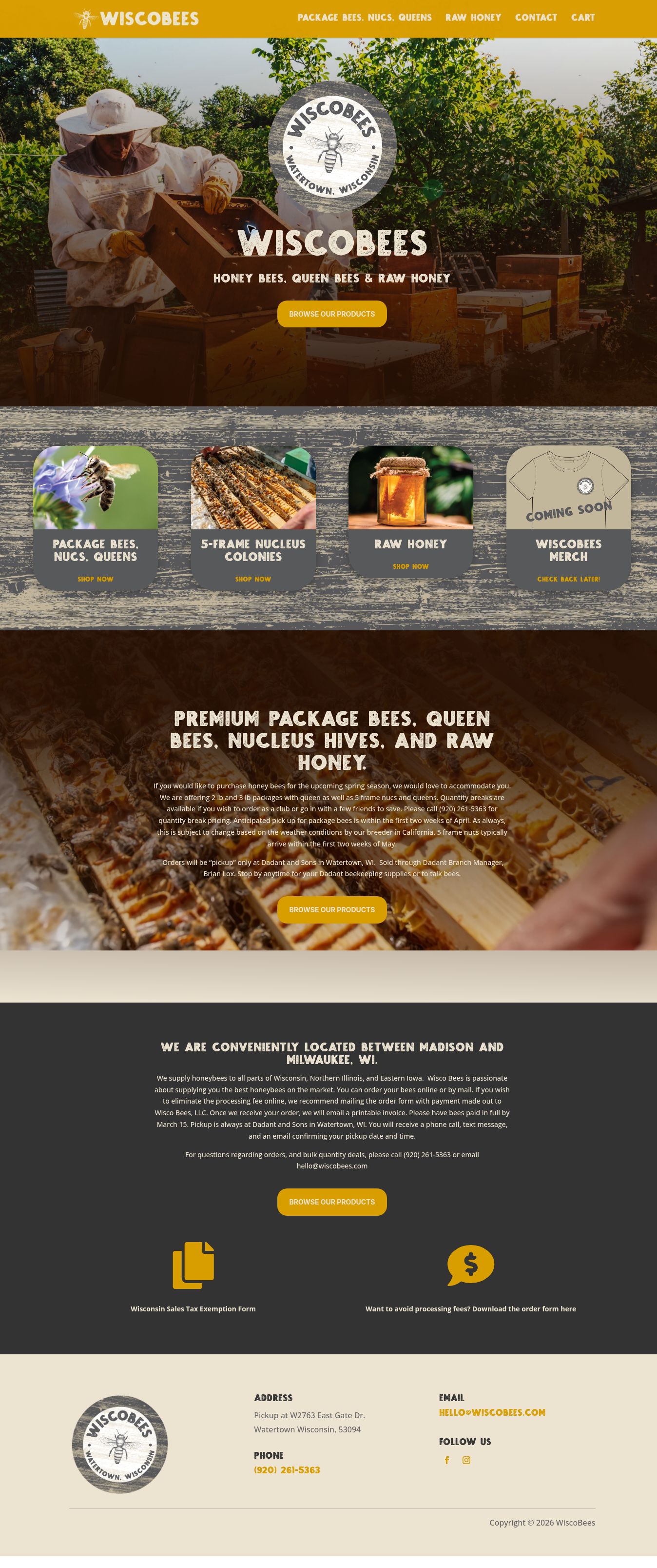

Actual homepage captures · Desktop & mobile
View the full homepageA consistent experience
from first visit to purchase.
The site carries the same visual identity into product discovery and online ordering. Large photography introduces the business, while clear product categories lead visitors into the store.
Visit WiscoBees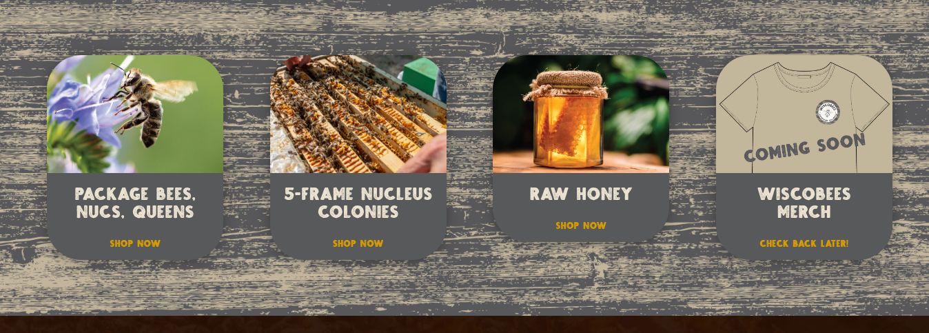
PRODUCT LABEL DESIGN
Five products.
One family.
I created a label system for the original honey and four flavored varieties. Each product has its own color palette and illustration, with a consistent hierarchy, typography, and product information across the range.
The label collection
Original print artwork · 8 oz front labels
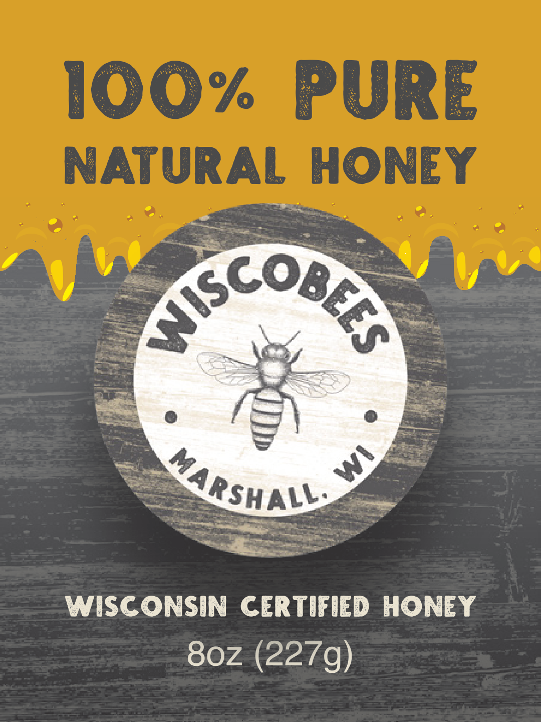
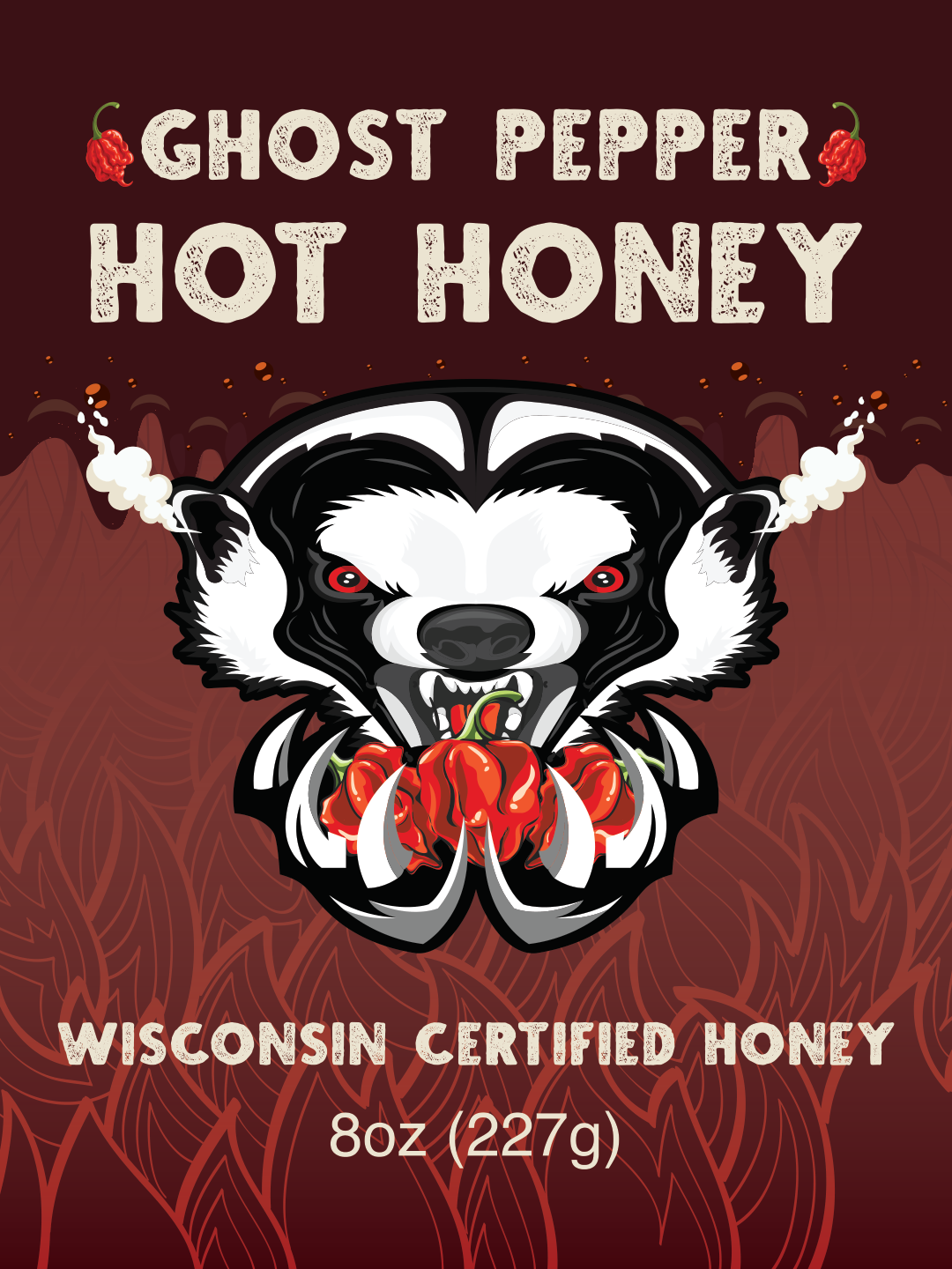
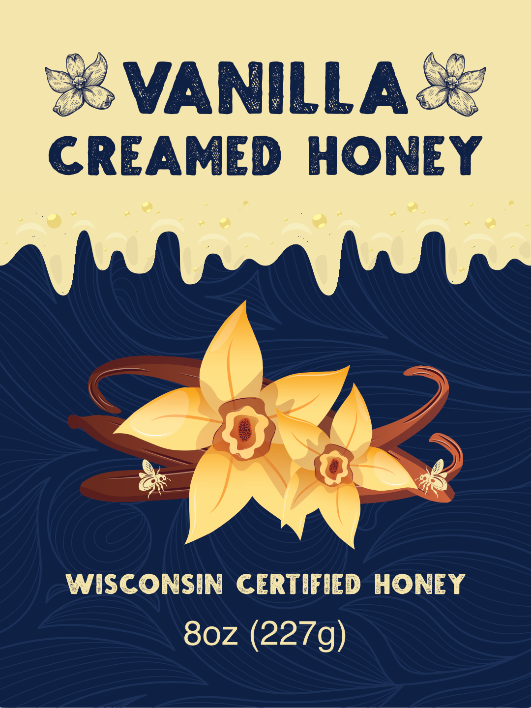
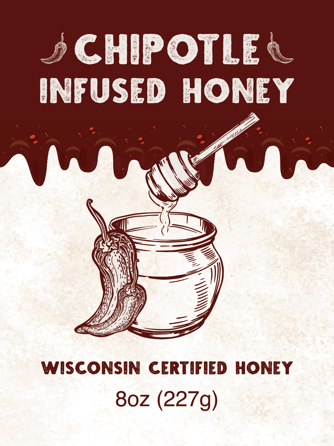
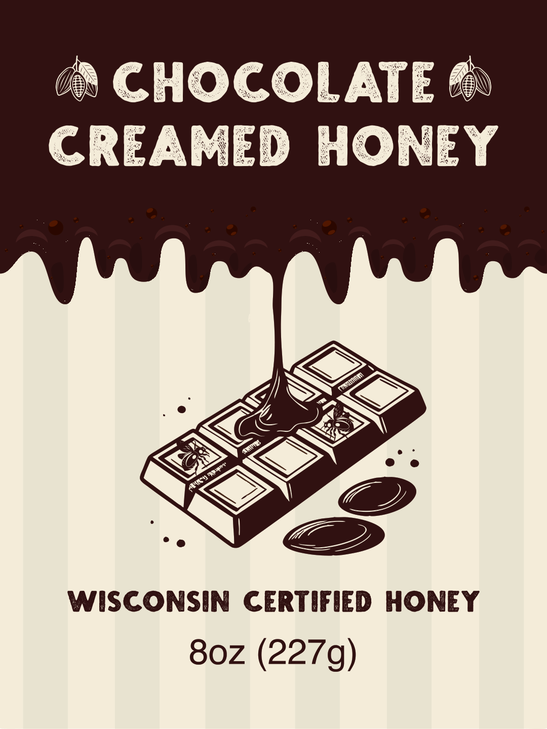
Select a label to view the original artwork.
PACKAGING SYSTEM
Different sizes.
The same identity.
I adapted the original-honey artwork across multiple package sizes, balancing the brand, product name, and net weight within each format.
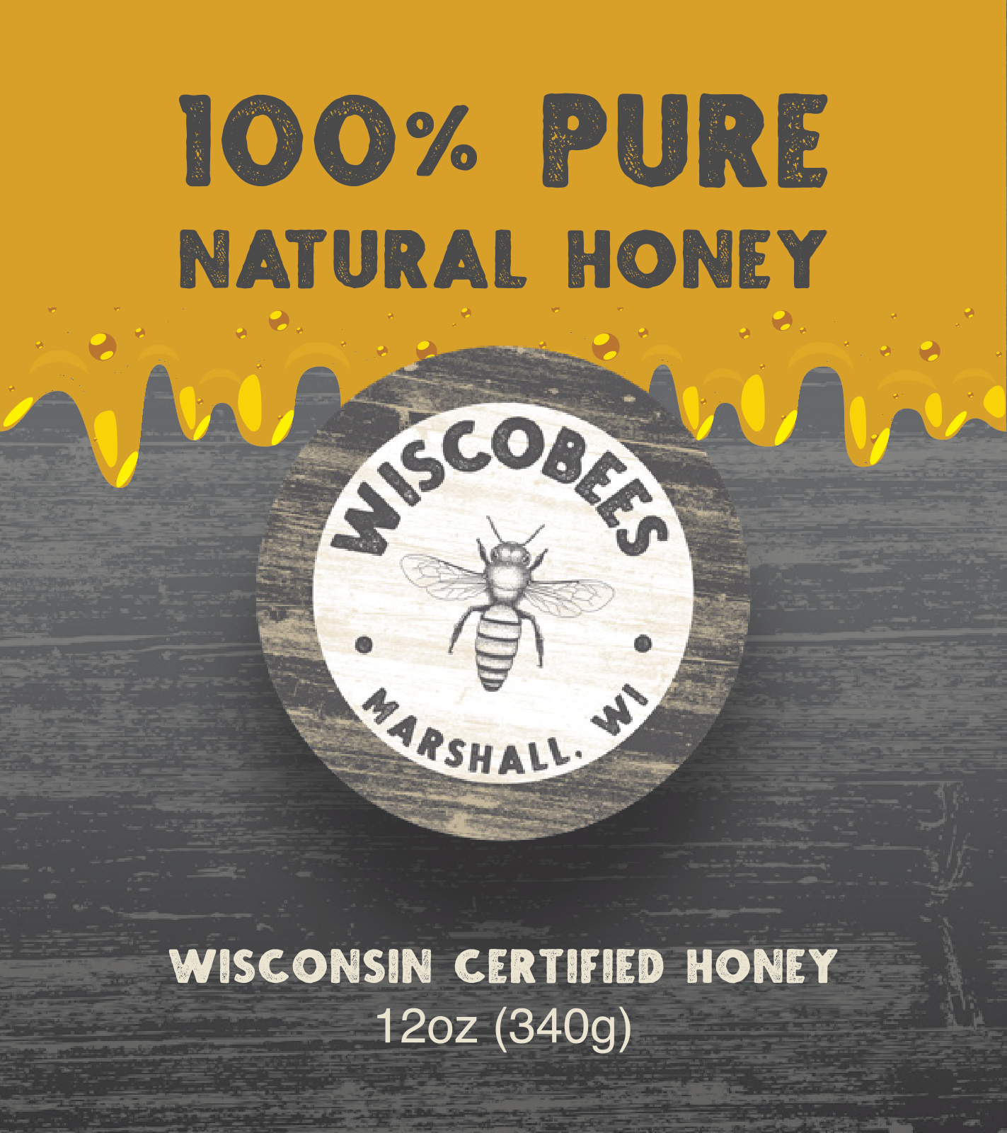
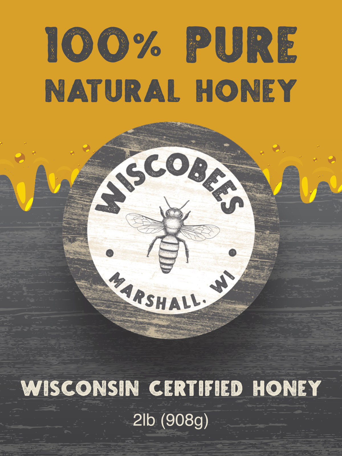
Selected original-honey formats, shown in relative proportion.
RETAIL PREPARATION
The details
behind the label.
I handled UPC registration and barcode integration, and prepared size-specific nutrition and net-weight information. That work brought the packaging beyond the front design and into the practical details of selling a physical product.
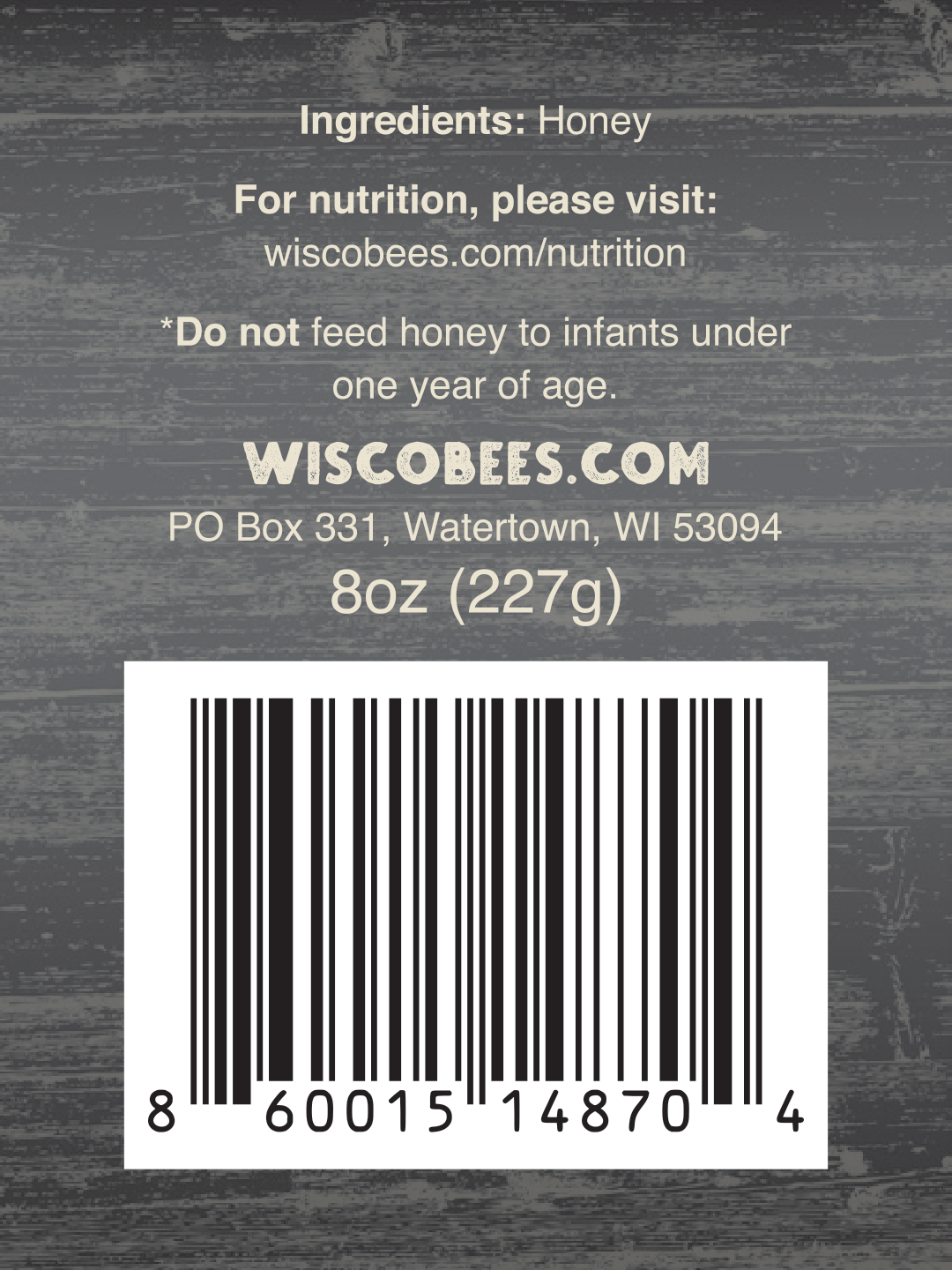
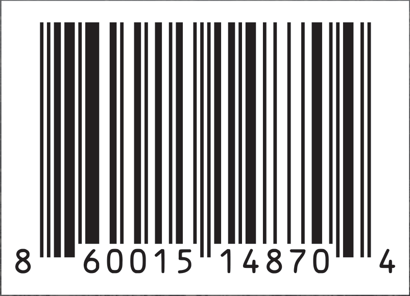
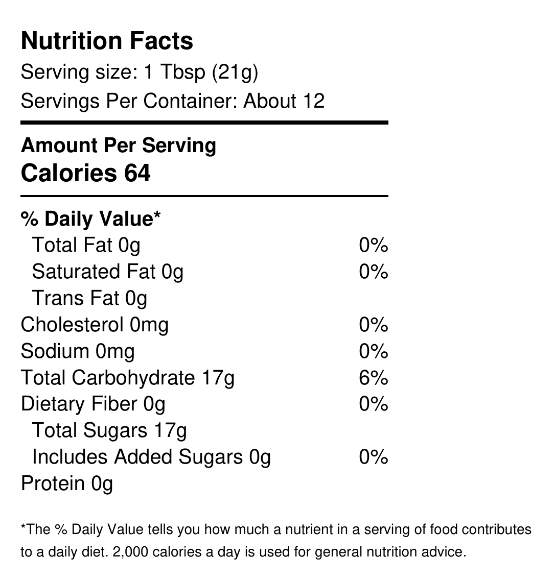
The current back labels reference online nutrition information. The Nutrition Facts panel shown here is a separate supporting asset.
WISCOBEES / BRAND · COMMERCE · PACKAGING
One consistent brand,
from the website to the shelf.
I brought the identity, online store, and product packaging together, including the details that support retail presentation.